If you’re a website owner or developer, you may have heard about the importance of analyzing your website’s performance to ensure a good user experience. One important tool for this task is the request map, which shows all the HTTP requests that a web page makes and how they contribute to the overall load time. In this article, we’ll explain what a request map is, how to read it using a waterfall chart, and how to use the information to improve your website’s speed.
We’ll also introduce a tool that can help you visualize and analyze your website’s request map using either a waterfall or a treemap chart.
First things first, if you don’t have already a Wattspeed account go ahead and create one, it’s free, or if you need our premium features, you can test them for 7 days using a Pro plan.
Once you’ve done added your first web page, head to the Snapshot -> Page Source report. This is the place where you will find different tools that makes it easy for you to analyze your page. One of them is the Request Map.
What is a request map?
A request map is a visual representation of all the HTTP requests that a web page makes when it is loaded in a web browser. Each request corresponds to a resource that the page needs to display, such as an HTML file, an image, or a script. The map typically shows the request order, the request type, the size of the resource, and the time it takes to load.
How to read the Waterfall chart?
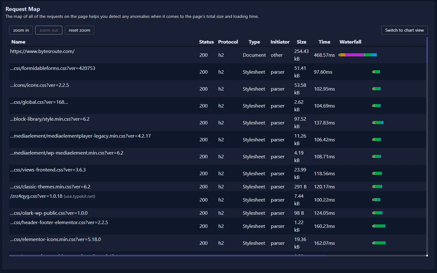
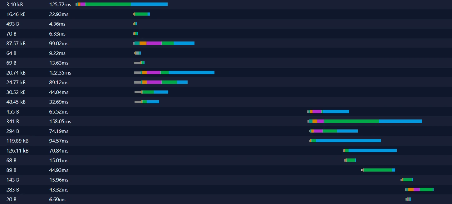
A waterfall chart is a common way to display a request map. It shows each request as a horizontal bar, with the bar’s length representing the time it takes to load the resource. The bars are stacked in the order that the requests were made, so you can see how each resource contributes to the total load time.

The chart typically includes labels for each request, showing the

- The URL of the resource
- Response code
- Protocol
- Request type (Document, Stylesheet, Script, Font, Image)
- Initiator: the component that initiates this particular request.
- Size
- Time
- Waterfall
Basically, it is a table with loaded resources that also has a timeline called waterfall, that represents the chronological loading order of the requests.
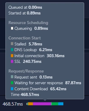
Let’s stop a bit in the waterfall section. As you can see, it is composed of multiple horizontal bars, each with its own color. While you will be hovering over the waterfall, multiple metrics related to that specific resource loading will be displayed.
Resource Scheduling
- Queuing: The browser waits for other requests that have a higher priority, there are too many connections opened for the origin or the browser is allocations space in disk cache.
Connection Start
- Stalled: The reasons are the same one as those from the queuing section.
- DNS Lookup: Resolving the IP address.
- Initial connection: TCP handshakes and retries.
- SSL: Negotiating the SSL certificate.
Request/Response
- Request sent: The request was sent.
- Waiting for server response (TTFB): TTFB stands for Time To First Byte. This time includes one round trip of latency and the time it takes the server to prepare the answer.
- Content Download: Response was received by the browser. This value represents the entire time spent reading the answer body. Larger-than-expected values may indicate a slow network or because the browser is busy doing something else that prevents the answer from being read.
What is a Treemap chart?
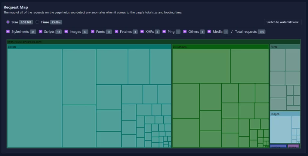
A treemap chart is another way to display a request map. It shows each request as a colored rectangle, with the rectangle’s size representing the size of the resource and the color indicating the request type. The rectangles are grouped into categories based on the domain or directory of the resource, so you can see which parts of the website are using the most resources.

To read a treemap chart, you can start by looking at the largest rectangles, which represent the resources that use the most space. You can hover over a rectangle to see more information about the request, such as the URL, the size, and the type.

How Can You Improve Your Website’s Speed by Analyzing the Request Map?
By analyzing your website’s request map, you can identify which resources are taking the longest to load and optimize them. For example, you may find that some images are too large or that some scripts are blocking the page from loading. By reducing the size or number of these resources, you can improve the overall load time of the page. You can also use the request map data to enhance your server and caching settings, allowing the user to access content faster.
To summarize, understanding how to read a request map is a crucial skill for anyone looking to improve the performance of their website. You may see and analyze your website’s request map using a waterfall or treemap chart to detect bottlenecks and optimize your resources. Our tool, which displays the request map using either charts, can assist you in getting started with this activity and advancing your website.
